
Generate Multi-Angle Character Views in Impasto Oil Paint Style
Impasto oil paint is the most tactile of all art styles – thick buttery strokes built up with palette knives, brush ridges that catch gallery light, and canvas weave that shows through the paint body. When applied to multi-angle character art, the challenge is not just generating the look at one view but maintaining consistent brushstroke direction that makes physical sense as the character turns. A highlight stroke that sweeps left-to-right at front view should not suddenly sweep top-to-bottom at profile – the lighting direction must remain fixed. Answer: Our multi-angle generator produces 8-angle character sets in impasto oil paint style with visible palette-knife strokes, directional brushwork consistent with a single light source, adjustable canvas texture overlay at gallery-print resolution (4800x6000px, 300dpi at 16x20in), and export settings calibrated for fine art giclee printing.
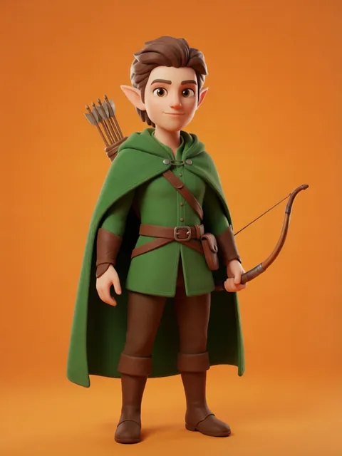
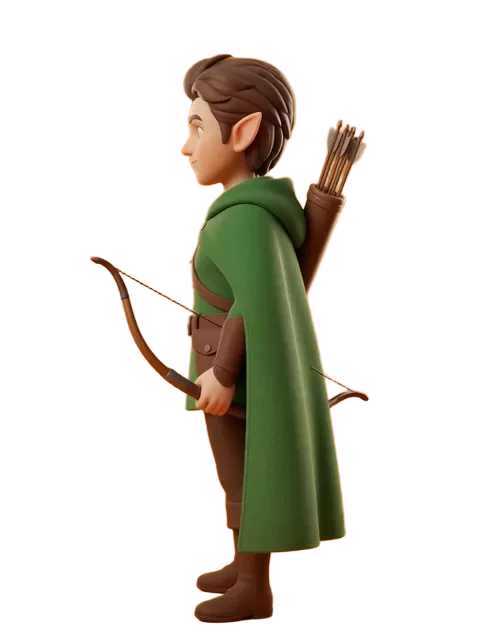
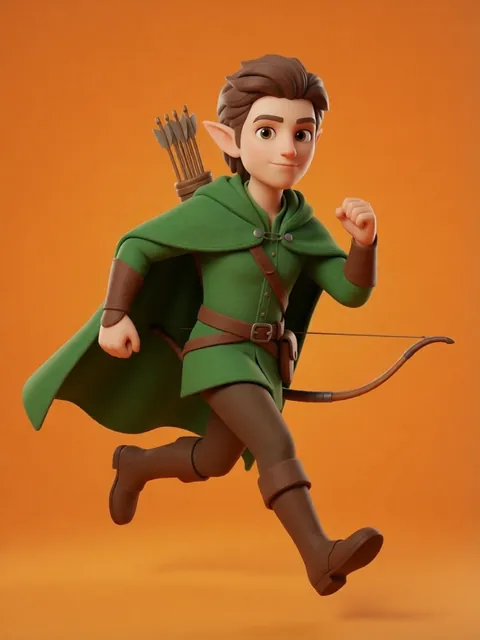
- 01
Upload your character reference image
Start with a front-view character reference at the highest resolution available. The impasto style generator works from your reference to apply oil-paint rendering: thick brushstrokes following form contours, palette-knife flat areas for background and broad planes, and visible paint-body buildup at highlight peaks.
- 02
Generate 8-angle set in impasto style with visible brushstrokes
Run the full 8-angle rotation with the impasto oil preset. Each angle receives thick paint-body simulation with directional strokes following the character’s surface planes. Brushstroke width and paint buildup respond to lighting: highlight zones get the thickest impasto peaks, shadow zones show thinner paint with canvas texture visible beneath. The effect should look like a single painting session from one fixed easel position.
- 03
Verify brushstroke direction consistency for unified lighting
With the light source fixed (e.g., upper-left at 45°), brushstrokes highlighting form should sweep consistently relative to that light direction. A highlight on the character’s left cheek should appear at angles where that cheek faces the light and disappear when it turns away. Check that stroke direction on equivalent planes (left shoulder at 0° vs. left shoulder at 180°) respects the same light source position.
- 04
Adjust canvas texture overlay level per angle
Apply canvas weave texture (medium-grain linen or fine cotton duck) uniformly across all angles. The texture should be most visible in shadow zones (thin paint) and least visible in highlight peaks (thick paint). Set texture opacity to 12-18% based on your output medium: lower for screen display, higher for print where texture adds perceived value.
- 05
Export at gallery-print resolution for fine art output
Export all 8 angles at 4800x6000px (300dpi at 16x20in) with Adobe RGB (1998) color space for giclee printing. Deliver as 16-bit TIFF files with embedded color profile. For art-book use, export at the book’s actual trim size + 3mm bleed. Include a downscaled web version at 1920px wide in sRGB for online gallery and portfolio display.
- Impasto highlights should follow the plane changes of facial anatomy – brushstrokes on the nose bridge should be vertical, on the cheekbone diagonal, on the forehead horizontal; random stroke direction reads as digital filter not painting
- Use a single virtual light source for all 8 angles – moving the light between views destroys the illusion that this is one character observed from different positions
- Canvas texture choice matters: fine linen (40-50 threads/inch) for detailed character work, coarse burlap (20-30 threads/inch) for expressive painterly effects with visible weave showing through thin paint areas
- For art-book reproduction, export an additional unsharpened version – print production sharpening at the press stage differs from screen sharpening and double-sharpened images look crunchy in print
- Include a flat-lay reference photo mockup showing your character’s front view in a gallery frame on a white wall – this helps buyers visualize the finished piece and increases print sales conversion
- For premium art prints, add 0.25-inch white border around each angle export – framers need this for matting and it signals gallery-quality presentation
- The thickest impasto peaks should be in the 2-4mm simulated paint height range – beyond this reads as sculptural relief rather than oil painting
- If selling prints, export a signed/numbered edition mockup template showing edition size and signature placement – limited edition framing commands 2-3x the price of open-edition prints
Frequently asked questions
What resolution and color space should I use for fine art giclee printing?
How do I keep brushstroke direction consistent as the character rotates?
Can I generate impasto oil paint multi-angle views on the free tier?
What paper stock should I use for impasto-style character art prints?
Ready to create consistent character views?
Upload a reference image and generate multi-angle views that stay true to your character.
Start generating