
Generate Multi-Angle Views in Crosshatch Pen-and-Ink Style
Crosshatch pen-and-ink is the backbone of black-and-white illustration — fine nib lines layered at opposing angles to build tone, parallel hatching for shadow depth, and stippling for organic texture. This style produces character reference sheets that look like they came straight from an indie comic interior or a wood-engraving revival print. Answer: Start by describing your character in tonal value zones (light, mid, dark) so the AI knows where to apply dense hatching versus open white space. Generate a full 8-angle set — front, back, left, right, 3q4 front, 3q4 back, above, below — in pure monochrome ink. Verify hatching direction stays consistent across all angles under a single light-source assumption. Check line weight hierarchy: thick outlines, medium interior contour lines, fine hatching marks. Export at 600dpi bitmap TIFF for crisp offset-print reproduction.
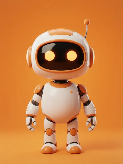
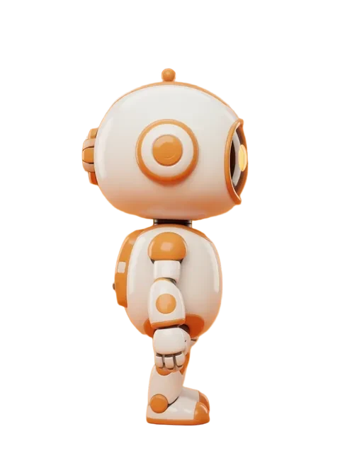


- 01
Describe character in tonal value terms
Map out light, mid, and dark zones on your character before generating. The AI uses these zones to decide hatching density — open white for highlights, single-direction hatching for midtones, crosshatch layering for deep shadows. Avoid describing colors; think in grayscale values from 0 (white) to 10 (black).
- 02
Generate 8-angle set in crosshatch pen-and-ink style
Use the multi-angle generator with the crosshatch pen-and-ink style preset. Request all 8 standard angles. Specify nib width (fine/medium/broad) and hatching character (tight mechanical or loose organic). Pure black ink on white paper — no grayscale washes, no color.
- 03
Verify hatching direction consistency across angles
Check that the implied light source stays fixed across all 8 views. Hatching on the character’s left side in the front view should match hatching on the left-side view. Inconsistent hatching direction reads as a lighting error and breaks the reference sheet’s credibility.
- 04
Check line weight hierarchy
Confirm three distinct line weights: thick outlines defining the character silhouette, medium-weight lines for interior contours and major forms, and fine lines for hatching and stippling detail. If line weights blend together, adjust the generation prompt to strengthen weight separation.
- 05
Export at 600dpi bitmap TIFF for print
Raster output at 600dpi bitmap (1-bit) TIFF ensures every ink line reproduces crisply on offset or digital press. Avoid JPEG compression which introduces artifacts around fine lines. If using the images digitally, also export a 300dpi grayscale TIFF for screen display with anti-aliasing.
- Specify "pure black ink, no grayscale washes" in your prompt — any mid-gray will reproduce poorly in bitmap print
- Use stippling for organic textures like skin, scales, or rough fabric; use crosshatching for geometric shadows on armor or hard surfaces
- The 3q4 front angle is the most important for crosshatch character sheets because it shows both face detail and body shadow structure
- If hatching looks muddy at small display sizes, increase the spacing between hatch lines rather than reducing line count
- Test print a single angle at intended reproduction size before generating the full 8-angle set — nib-width issues are hard to spot on screen
- For tattoo flash reference sheets, add 2pt extra outline weight so designs read clearly through stencil transfer paper
- Batch-generate lighting reference: run one angle with light from top-left, top-right, and directly above to confirm the hatching pattern reads correctly
- Archive the raw prompt used per angle so you can regenerate a single angle later without restyling the entire set
Frequently asked questions
What is crosshatch pen-and-ink style and why use it for character reference sheets?
How many angles should I generate for a crosshatch character reference sheet?
Can I generate crosshatch pen-and-ink character references on the free tier?
What resolution should I export crosshatch character art for professional printing?
Ready to create consistent character views?
Upload a reference image and generate multi-angle views that stay true to your character.
Start generating