
Create Character Art for Skillshare Class Thumbnails with a Consistent Instructor Mascot
Skillshare thumbnails live or die on click-through rate. Classes with a recognizable instructor mascot — a consistent illustrated character that represents you across every class — build brand recognition and subscriber trust faster than faceless graphics. Multi-angle character references let you pose that mascot differently for each class topic (explaining, demonstrating, celebrating) while keeping the character 100% recognizable. Answer: Use multi-angle character reference generation to design your instructor mascot once, then pose it per class topic at 1280x720px. Your mascot becomes the visual anchor of your Skillshare channel, making every new class immediately identifiable as yours in a crowded browse feed.
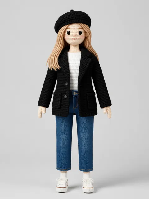
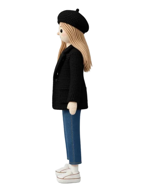
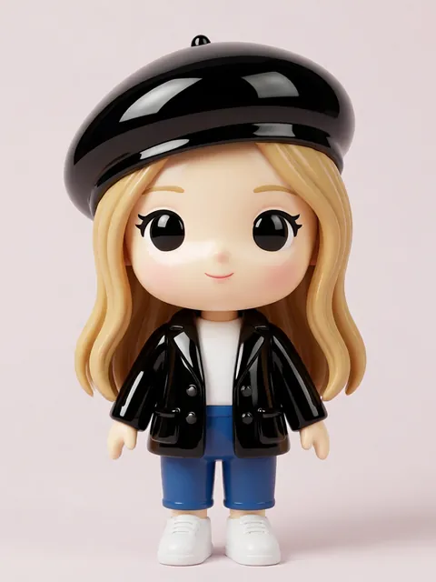
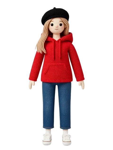
- 01
Design your instructor mascot character
Create a cartoon-style mascot character that embodies your teaching persona. The character should be simple enough to read at thumbnail scale (recognizable face, distinctive hair or glasses, signature outfit element) but expressive enough to convey different emotions. Choose 3-4 brand colors that will appear in every thumbnail — this palette becomes your channel visual signature across all classes.
- 02
Generate 8-angle reference for thumbnail reuse
Produce an 8-angle reference sheet for your mascot showing front, front-3q4, right-profile, back-3q4, back, back-3q4-left, left-profile, and front-3q4-left views. For Skillshare thumbnails, the front-3q4 angle is your workhorse — it faces the camera with enough angle to feel dynamic while keeping the face readable at thumbnail size. The profile angles are useful for dialogue-style thumbnails where the mascot appears to be talking to text elements.
- 03
Pose the character per class topic
Create three core mascot poses matched to class type. For beginner/introductory classes, pose the mascot explaining — hand gesture toward the viewer, friendly expression, open body language. For technique/demonstration classes, pose the mascot demonstrating — hands working on something, focused expression, action-oriented stance. For project/showcase classes, pose the mascot celebrating — arms up, proud expression, finished work visible. Each pose pulls from the closest reference angle.
- 04
Compose at 1280x720px with Skillshare-optimized layout
Design each thumbnail at exactly 1280x720 pixels (16:9 aspect ratio). Use one of two proven layouts: character on the left third with class title text occupying the right two-thirds, or character centered with title text overlaid. Keep the background simple — a solid brand color or subtle gradient — so the character and text pop. Add 2-3 short title words in a bold, readable font (minimum 48pt equivalent at thumbnail scale).
- 05
Export as RGB JPEG with high contrast for thumbnail-scale readability
Export each thumbnail as an RGB JPEG at 1280x720px with compression quality set to 85-90%. Boost contrast slightly beyond what looks natural at full size — thumbnails displayed at 200-300px wide in the Skillshare browse feed lose subtle tonal variation. Test each thumbnail by viewing it at 25% scale (roughly browse-feed size) and checking that the mascot face and title text are both clearly readable.
- A/B test two thumbnail variants for your first class launch — same mascot, same title, but different poses or background colors. The Skillshare algorithm rewards higher click-through rates, and small thumbnail differences can shift CTR meaningfully.
- Keep your mascot face large enough in the thumbnail — faces smaller than 25% of the frame height become unrecognizable at browse-feed scale. When in doubt, crop closer to the face.
- Use the same font family across all your class thumbnails. Typographic consistency builds channel identity just as much as character consistency does.
- Design your thumbnail with a mobile-first mindset. Over 60% of Skillshare browsing happens on phones, and your mascot needs to read clearly at approximately 150px wide on a phone screen.
- Add your mascot to the class preview video thumbnail as well. Students who see the same character on the course card and the preview video feel a stronger sense of brand continuity before they even click enroll.
- Create a seasonal variant of your mascot for holiday-themed classes or limited-time workshops — same character, but with a Santa hat or seasonal outfit change. Fans notice and appreciate these details.
- Export a square-cropped version (720x720px) of each thumbnail for promoting your class on Instagram and Twitter. The mascot should remain the focal point even in the square crop.
- Document your mascot color palette (hex codes) and font choices in a simple brand sheet. If you collaborate with another instructor or hire a thumbnail designer, they can match your established visual identity without guessing.
Frequently asked questions
What is the exact Skillshare thumbnail size and format?
Can I create thumbnails for multiple classes using the free tier?
What art style works best for Skillshare thumbnails?
Should I use my real photo or an illustrated mascot for Skillshare thumbnails?
Ready to create consistent character views?
Upload a reference image and generate multi-angle views that stay true to your character.
Start generating