
Create Character Art for Light Novel Illustrations
Light novel publishers receive hundreds of submissions monthly, and the ones that land on an editor’s desk share one trait: technically flawless art specs. CMYK color space at 300dpi for the cover and color inserts, 600dpi grayscale with proper screentones for interiors, and character consistency across every illustration. A protagonist whose eye shape shifts between the frontispiece and chapter three screams amateur to an acquisitions editor. Answer: Our multi-angle generator creates publisher-spec reference sheets that lock character design across all views. Export CMYK color art from front-3q4 angles and B&W line art interiors from matching references, all at the trim sizes and bleed requirements major publishers demand.
- 01
Design your LN protagonist in clean anime style
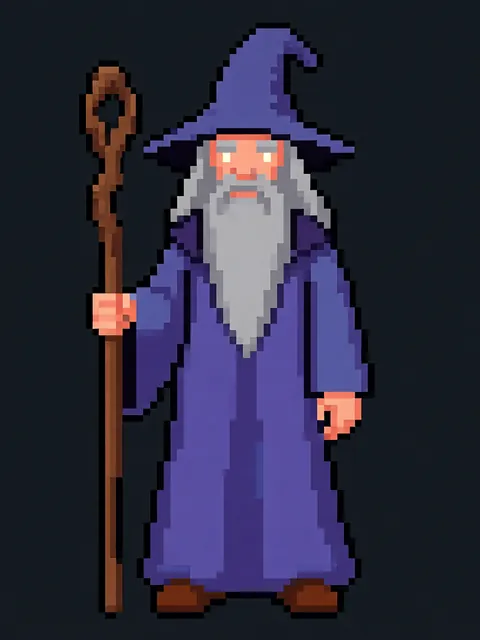
Start with a front-view concept emphasizing clean line art and distinct facial features. Light novel interiors are B&W, so design silhouette and hair shape for strong grayscale readability. Avoid overly complex costume details – they become muddy in screentone reproduction.
- 02
Generate 8-angle reference for illustration consistency
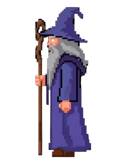
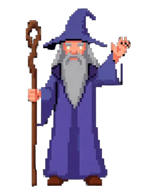
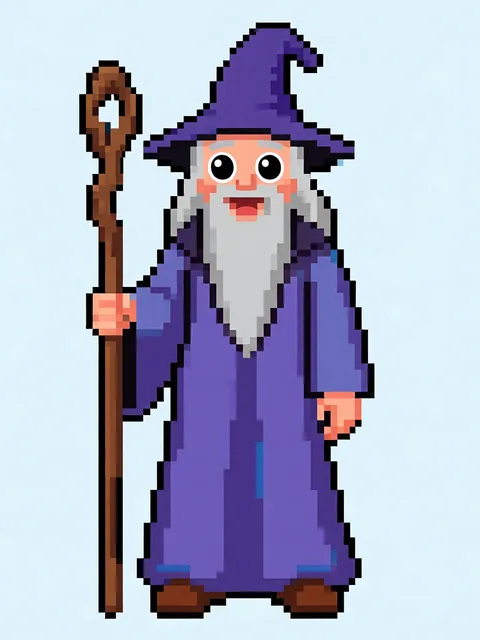
Run the 8-angle rotation set from your front-view design. This becomes your animation-style reference sheet that every illustration will reference. Pay special attention to eye shape, hair parting, and accessory placement across angles – these are the consistency breakers editors flag first.
- 03
Create CMYK color cover art from the front-3q4 reference
Using your established character reference, generate a front-3q4 angle illustration at 300dpi in CMYK color space with 3mm bleed. This serves as both your cover submission and the color frontispiece (kuchi-e) that opens the volume. Maintain trim size awareness: A5 (148×210mm) for JP market, 5.5×8.5in for US trade paperback.
- 04
Create B&W line art interiors from your reference angles
Generate 3-5 monochrome interior illustrations from your character reference, then upscale them with the built-in AI Image Upscaler and convert to 600dpi grayscale in Photoshop or Clip Studio Paint. Apply screentone patterns (standard 42.5 LPI / 10% increments) for shading in the same tool. Select angles from your reference sheet that serve key story moments: dramatic 3q4 for confrontation scenes, profile for dialogue, back view for establishing shots.
- 05
Export publisher-ready package with technical specs
Deliver a complete submission package: (1) color cover art at A5 + 3mm bleed in CMYK .tiff, (2) color frontispiece at matching specs, (3) 3-5 interior B&W illustrations at 600dpi grayscale .tiff with screentones, (4) character reference sheet showing 8-angle consistency proof, and (5) layered working files (.psd or .clip) for the publisher’s production team.
- Submit in the publisher’s preferred trim size – Seven Seas uses 5.875×8.25in, Yen Press uses 5.5×8.5in, J-Novel Club is primarily digital-first but requests A5 for print editions
- Screentones look professional at 42.5 LPI with 10% dot increments – avoid 5% dots which disappear at print scale and 80%+ which close up into solid black
- Include 3mm (0.118in) bleed on all color pages but never extend important character details into the bleed zone – editors trim aggressively
- For the color frontispiece, use the same character angle as the cover but with opposite lighting direction – this shows range without redesigning
- B&W interior illustrations should use exactly 3-4 line weights: thick for silhouette outlines, medium for internal contours, thin for detail lines, and hair-thin for screentone borders
- Convert to grayscale profile (Dot Gain 20%) not just desaturate – RGB-to-grayscale conversion without profile management creates flat, muddy blacks
- Label your submission files with publisher naming convention: [SeriesName]_[Vol#]_[IllusType]_[Page#].[ext] – editors batch-process hundreds of assets per volume
- Always include your working file with layers intact – if the publisher’s production team needs to adjust screentone density for their specific printer, flattened TIFFs force them to reject the submission
Frequently asked questions
What are the exact file specs for light novel publisher submissions?
How do I ensure character consistency across color and B&W illustrations?
Can I create light novel illustration references on the free tier?
What trim sizes and bleed settings should I use?
Ready to create consistent character views?
Upload a reference image and generate multi-angle views that stay true to your character.
Start generating